
Is your Website Mobile Friendly?
Over a period of time, when most of us actually surf more & more with our Cellular devices, it is high time now site owners ( New & Existing ) to think that is their site actually mobile friendly?

It has been generally bench-marked in most surveys that Cellular Internet penetration & usage is exponentially and some sites actually get more than 60% of Traffic at times through Cell phones.
What it requires to have Mobile Friendly Website?
It is not only about looks, but it is all about experience, and that makes the difference.
Google has recently launched a new label on Google Search Pages which clearly labels if the site is Mobile Friendly, if your website is not mobile friendly, Google Spiders will not label it and hence you may miss out a potential base of followers.
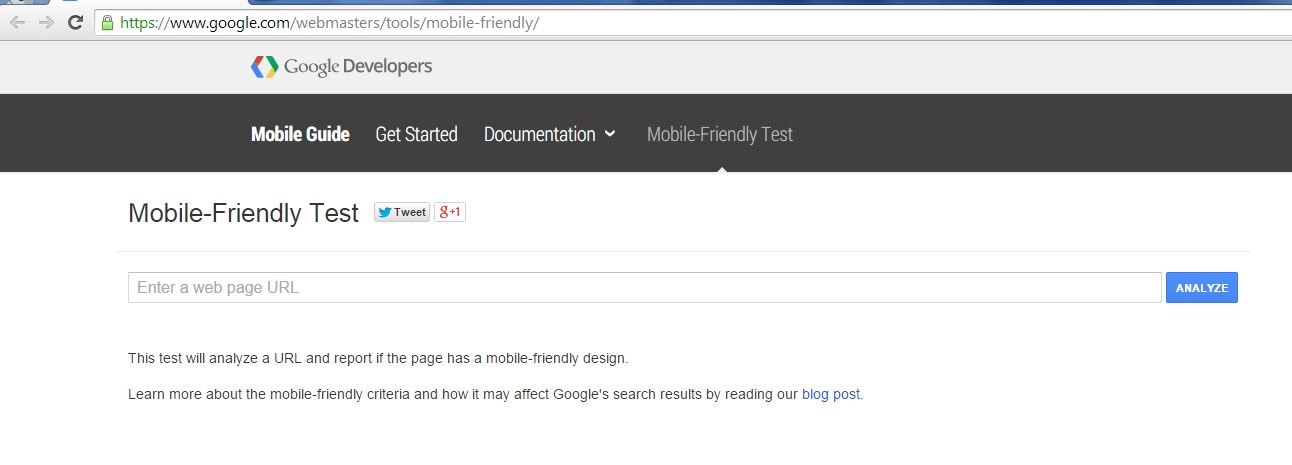
Online Mobile Friendly Tool
Google has also launched an online tool to check if your site is mobile friendly or not ( click here to check ), if the results are negative, it is high time to talk to your technical representative.
For those, who are still wondering that what are we talking about, Mobile Friendly Site in simple terms means that your site adapts itself according the the device of the reader and hence the experience is maintained. The user does not have to keep scrolling left to right and can engage smoothly with your site, example – as shown in image below.
Most of the CMS like WordPress now have variety of Responsive themes, and they are intelligent enough to adapt to most of resolutions of most of sites.
Also, if you are looking for revenue options like Adsense, again being Responsive is one of the factors which are critically evaluated.
It is always good to match up the expectations of the technology and the users, and now the demand is at all time high to be Mobile Responsive!